Instructions & Guidelines
Eligibility
The Conference Poster Competition is open to researchers, scientists, and innovators from all disciplines. Eligibility criteria may vary depending on the specific conference, but some general guidelines include:
- Researchers: Individuals currently engaged in research activities, including graduate students, postdoctoral researchers, and faculty members.
- Scientists: Individuals with expertise in a particular scientific field, including researchers, professors, and industry professionals.
- Innovators: Individuals with a demonstrated ability to develop new ideas, technologies, or processes.
Submission Guidelines
- To submit your abstract for the E-poster Competition, please follow these guidelines:
- Abstract length: 300 words or less
- Format: Microsoft Word or PDF
- Include: Title, authors, affiliations, abstract text, and keywords
Judging Criteria
Visual Appeal & Content Clarity
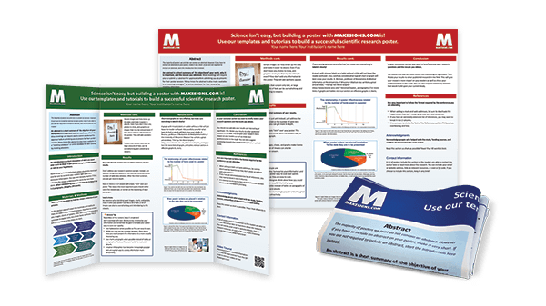
- Overall Design: The poster should have a visually appealing and organized design that effectively conveys the research findings.
- Use of Graphics: Images, charts, and graphs should be clear, relevant, and enhance the presentation of the research.
- Color Palette: The color scheme should be visually appealing and complement the overall design of the poster.
- Font Choice: The font style and size should be easy to read and consistent throughout the poster.
- Title: The title should be clear, concise, and accurately reflect the content of the research.
- Abstract: The abstract should provide a concise overview of the research, including the purpose, methodology, findings, and conclusions.
- Introduction: The introduction should clearly state the problem or question that the research addresses.
- Methodology: The methodology should describe the methods and materials used in the research in a clear and concise manner.
- Results: The results should present the findings of the research in a clear and organized manner, using tables, graphs, and other visuals when appropriate.
- Discussion: The discussion should interpret the findings of the research and discuss their implications.
- Conclusion: The conclusion should summarize the main findings of the research and state the significance of the work.
Originality and Significance
- Originality of Research: The research presented should be original and contribute to the advancement of knowledge in the field.
- Significance of Findings: The findings of the research should be significant and have the potential to impact the field or society.
Overall Impression
- Overall Quality: The overall quality of the e-poster should be high, with no grammatical errors or typos.
- Engagement: The e-poster should be engaging and effectively communicate the research findings to the audience.
- Professionalism: The e-poster should be presented in a professional manner and reflect the high standards of the research
Poster Layout and Design
- Divide the poster into clear sections: The poster should be divided into clear sections, such as Introduction, Methods, Results, Discussion, Conclusions, and Literature Cited. This will make it easier for viewers to navigate the information.
- Use a consistent grid: Use a consistent grid to align the text and visuals on the poster. This will create a visually appealing and organized layout.
- Leave white space: Leave white space around the text and visuals to avoid a cluttered appearance. White space makes it easier for viewers to focus on the important information.
- Use a hierarchical font scheme: Use a hierarchical font scheme to emphasize the different levels of information on the poster. For example, use a larger font size for the title and headings, and a smaller font size for the body text.
- Use a consistent font style: Use a consistent font style throughout the poster to create a cohesive look.
- Align the text and visuals: Align the text and visuals carefully to create a polished and professional look.
- Use a simple and clean design: Use a simple and clean design that is easy on the eye. Avoid using too many colors, fonts, or graphics.
- Use a consistent color scheme: Use a consistent color scheme that is complementary and visually appealing. Avoid using too many colors, as this can make the poster look cluttered.
- Use captions for images and graphics: Use captions to explain the meaning of images and graphics. This will help viewers understand the information.
- Use a consistent style for citations: Use a consistent style for citations, such as APA or MLA style.
